Stygian Sentinel 1
Progression of an Art Concept[edit]
Issue #1, May 29th 2015
Welcome to our inaugural edition of the Underworld Newsletter, The Stygian Sentinel, a new format for our weekly email to all our backers and followers. Hope you enjoy what you see, we’ll be doing further improvements to the layout going forward. Let us know what you think!
This week, Art Lead Dave Flamburis is going to take us through his process for creating concept art. Dave was tasked with concepting out how the natural caverns of the Underworld might be transformed into livable and utilitarian structures. Something the dwarves, elves or even some past race who existed in the Abyss might do. Enjoy!
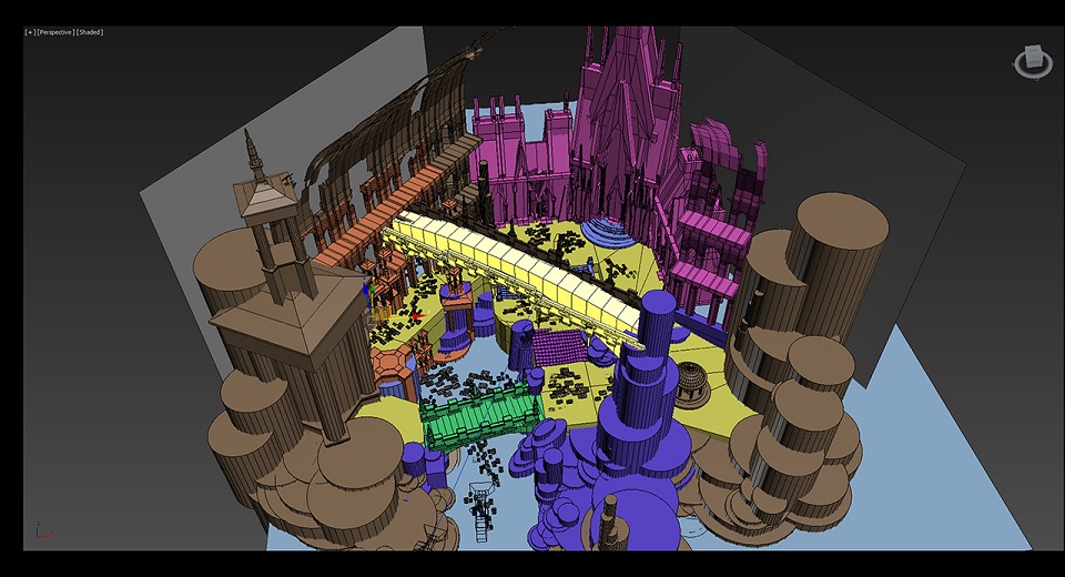
When starting a new concept piece I like to build up the “skeleton” of the composition. To do this I jump into a modeling program like 3DS Max where it’s easy to knock out basic shapes.
Here, we can see a top-down view of the space I'll be concepting. I'm going to set the camera across the diagonal so the lines of force converge on the Catherdral-like form's opening. The cylinders represent rock formations. The yellow components are the base terrain and an overhead bridge. The buildings have strong vertical lines and will be used to develop a signature look to much of the surrounding rock walls.
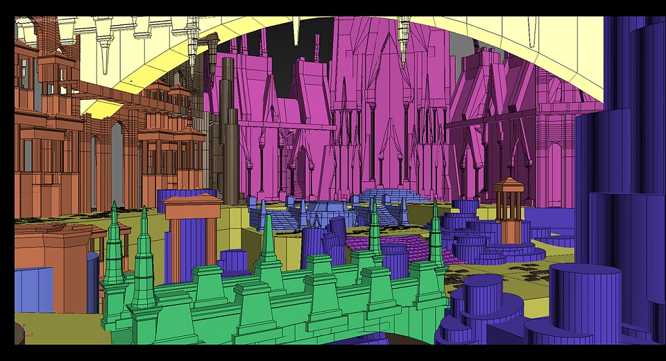
I'll create a camera with a wide field of view so it mimics an in-game POV and frame the scene out.
Here we can see the camera view from which I'll be developing the composition. I'm using a 75 degree field of view to keep more in line with in-game POV and frame the scene out. I'm using the yellow bridge form across the top of the frame to keep the current focus on the scene's middle-space.
Although the space will be primarily composed of natural components, you can see how perspective and verticality carry through when using classical structures and over-the-top cathedral-like elements. The cylindrical components push the scene up and break up the flatter yellow terrain.
I'm going with a broad composition with depth for several reasons. I'm interested in creating several areas of interest and I also want the option to close in on a portion of the scene.
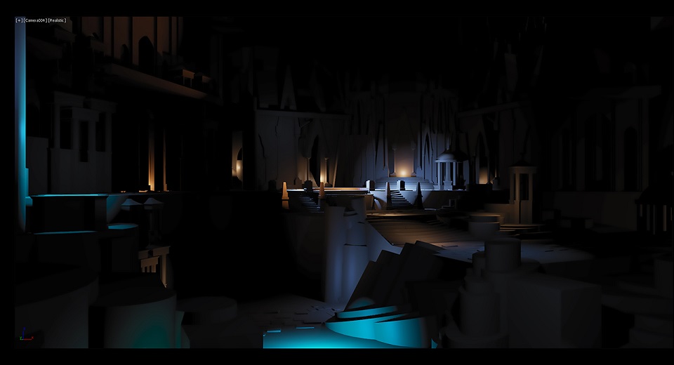
Once I have the scene elements composed, I'll add a flat grey material to the objects and start a light and shadow pass.
For this piece, I start with no lights at all, just a black scene, and add a single point light. And then another, and another. I'll add a few fill lights to pull out ambient form, but the key lights, which are brighter and colored, are the scene's focal points. So although the previous slide shows a much denser environment, we strip away most of the form and re-add it one light at a time.
The lights are casting shadows and are fully dynamic. I'm using 3ds max's Octane renderer, which allows me to use dynamic shadows directly in the viewport, so there's no need to render out a frame. It's a real-time environment and aside from lack of global illumination, it does a decent job of establishing mood.
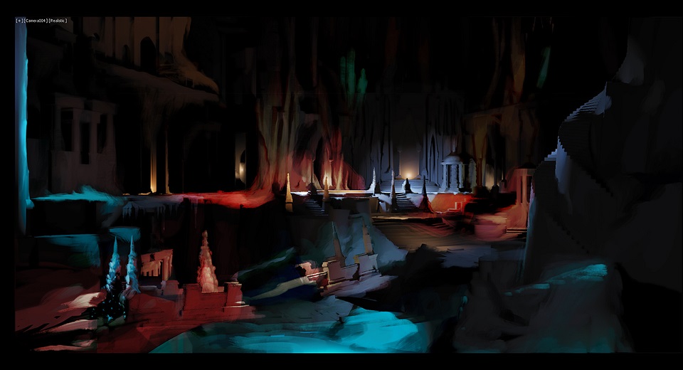
Next I'll snag the viewport and bring the image into Photoshop for overpainting.
The rock formations along the back are derived from the cathedral-like forms. There's a dynamic and fantasy aspect to the rocks. However, I left the center entrance more defined for contrast. I want a nice cluster of worked stone around the opening. I'm also playing with the idea of using stalagmites as small columns. Not quite sure if this is going to survive the concepting phase.
At this stage, I want to try out a few color ideas, so the palette is less unified and more experimental. I also destroyed the bridge and started merging the cylinder shapes into terrain. At this point, I also call in the team to give feedback. No need to wait for a finished piece for useful critique.
The team’s consensus is that the most interesting part of the piece is the area around the cathedral entrance, so I’m going to expand that more and use those elements through the rest of the piece. Folks also found the lower left of the painting, as well as the deformed bridge, to be confusing and not in line with the more solidly built structures surrounding them. It was also decided to add a clearer “pathway” through the piece so that viewers could imagine walking and exploring through the area.
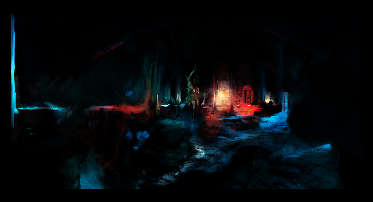
Here's the final image, where I unify the palette, incorporate the team feedback, and resolve a few other issues.
I want to go there! Imagine the things to discover. What is through the “cathedral” archway? Where do the stairs on the right go? So many shadowy alcoves, SOMETHING must be hiding there, right?
I hope you agree. Thanks for reading!
-Art Lead Dave
Other Stuff[edit]
For the past few months forumite Santa Clause has been posting into the forums some music pieces inspired by the Underworld. He’s redone some music from the original games in an orchestral style, and created new compositions inspired by his imaginings of walking through the Stygian Abyss. We are really enjoying the music here in the OtherSide offices, and we think you will too!
Check them out in the Fan Submissions forum and give Santa Clause some feedback and encouragement.
‘Till next week!
The OtherSide Team

